


Work Experience
Sr. Visual Designer
Norwood, MA
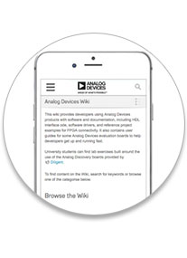
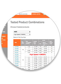
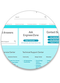
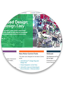
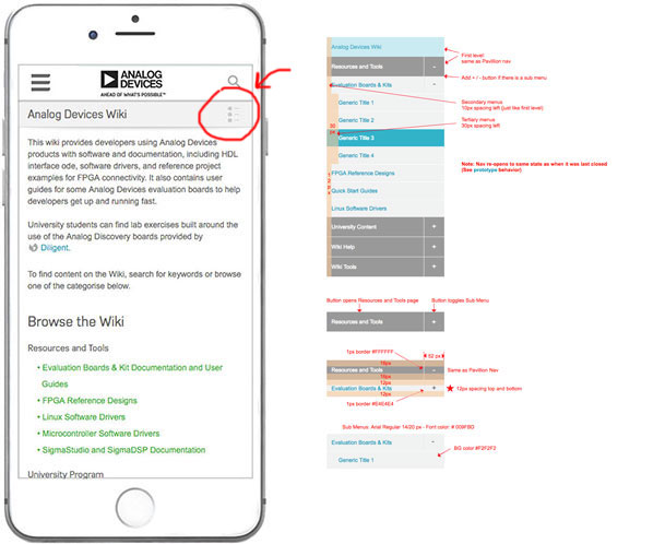
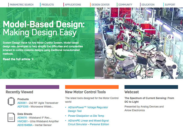
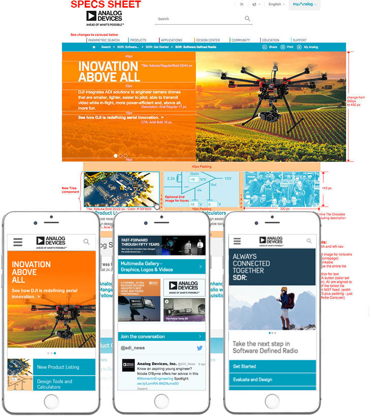
Analog Devices, Inc.
2015 to 2016
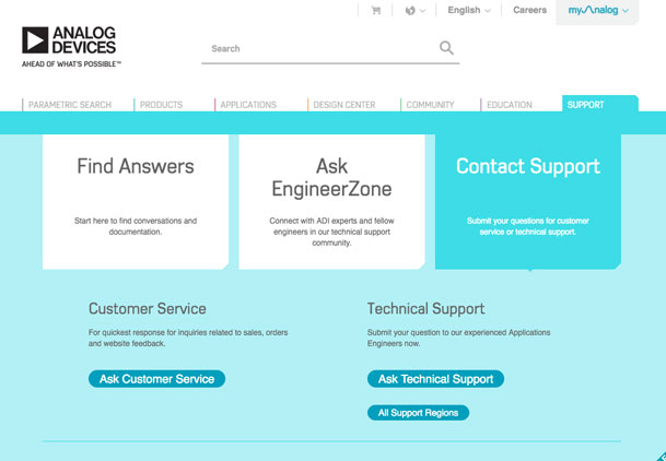
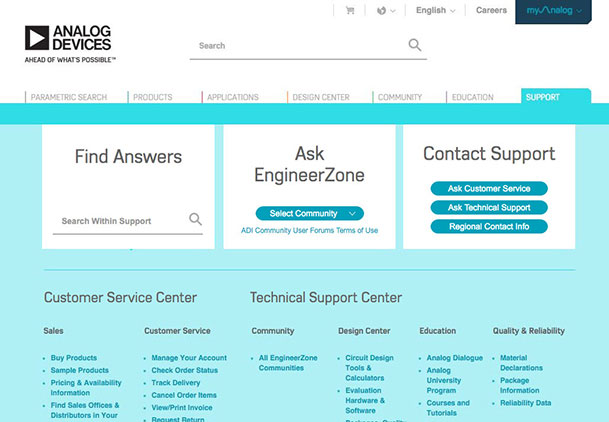
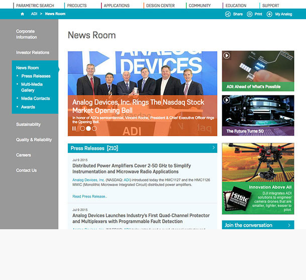
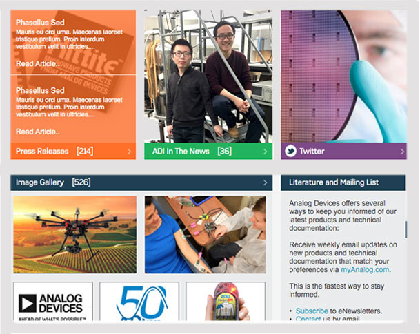
- Designing for Sitecore and large CMS platforms with modular/component based design
- Creating working prototypes with Axure. I was the Axure guru for the company
- Discovering and solving UX problems with a brand new site wide redesign of the company’s website
- Developing mobile versions for all the content
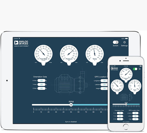
- Developing the look and feel of mobile apps including creating all design elements
- Creating and organizing components for the company’s module based website design
- Designing personalization based on GEOIP and History
- Organizing projects and creating extensive Axure libraries of the component structure of the site
- Creating an extensive library of Photoshop templates for all the types of graphics needed for the site
- Working closely with the Development Team to find HTML/CSS solutions for my designs
- Working with management and the Development Team to prioritize and schedule sprints
- Advising stakeholders on how to present content to users
- Creating multi-media assets and infographics for several campaigns
- Manipulating web graphics, isolating product shots and other production work
Freelance Graphic Design Consultant
Lexington, MA
xslDesigns
Current
- Desktop Metal Fab Flow Web App
UX/UI Design, wireframes and extensive working prototypes, icon creation, style sheet creation, working directly with develpment team. - Medullan Employee Assistance Program App
Assisting UX reserach and development, wireframes and prototype creation, icon creation, initial UI design and style sheet creation. - Carbonite CMS Redesign
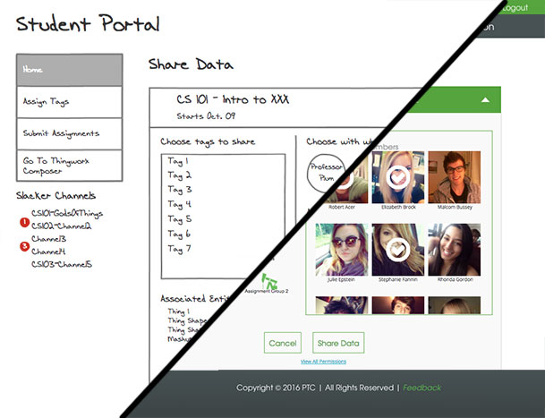
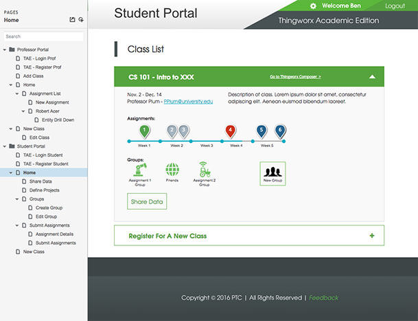
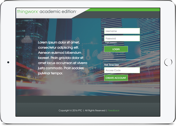
Assisting with creating new CMS system, icon and graphic design, expanding new UI design and fitting it to existing projects. - PTC portal design project
ThingWorx Academic Version Portal design and prototypes for university professors and students. - Fuseideas long-term design work
Connecticut Lottery print and digital media for multiple campaigns, masthead work for Philadelphia Airport, new mascot campaign for Florida Polytech, Social Media campaigns for Blue Cross Blue Shield - TechTarget multi-month design work
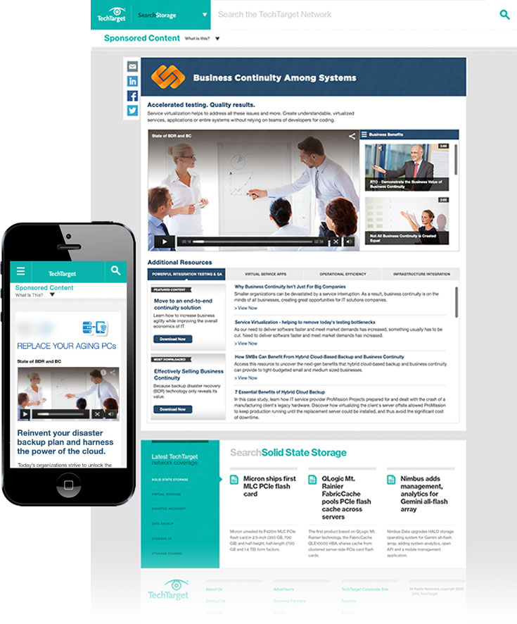
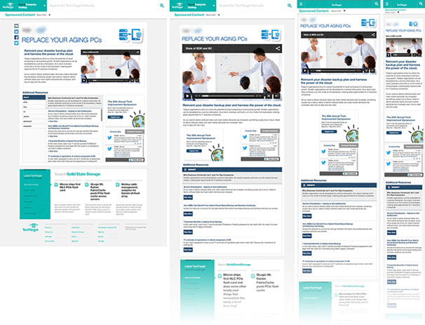
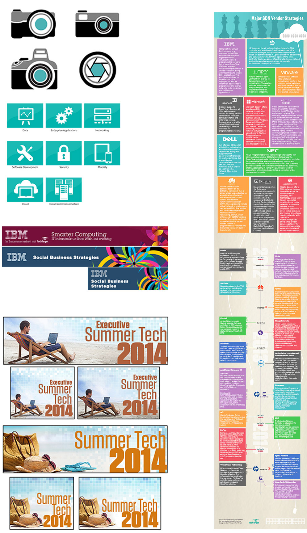
Corporate website templates, infographics, banners, icon creation, asset creation, responsive designs for old work - Sapphire Systems website design
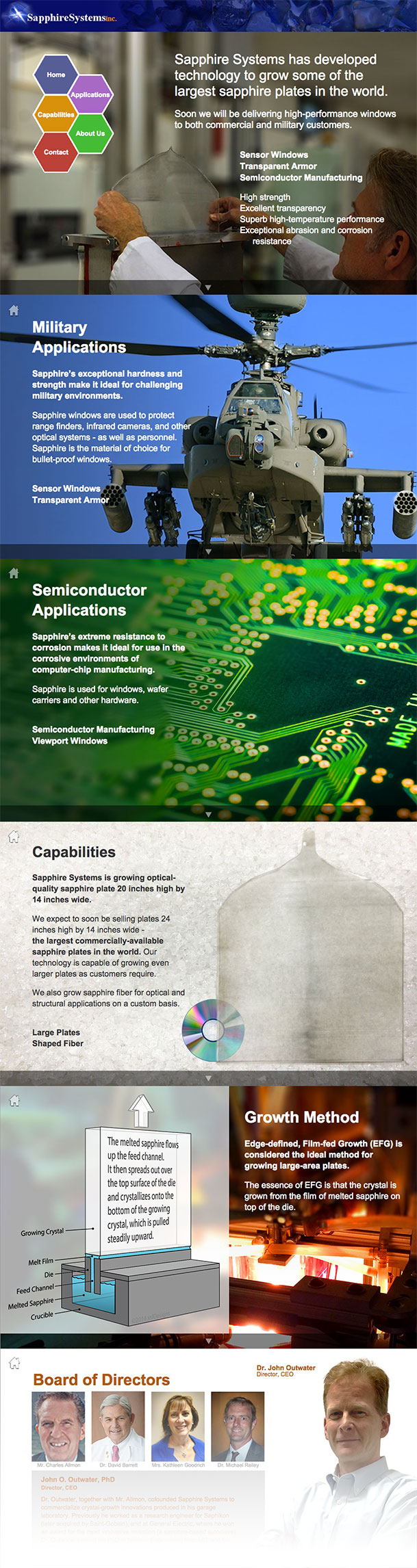
Client research, wireframes and styleboards, entire site build from scratch including graphic design and development, HTML, CSS, JavaScript and jQuery - Image retouching, banner creation, asset management, UX consulting
- Spreadsheet design, corporate ledger design, other corporate asset design using Microsoft Office, VBA and function design in Excel
UX Designer
Cambridge, MA
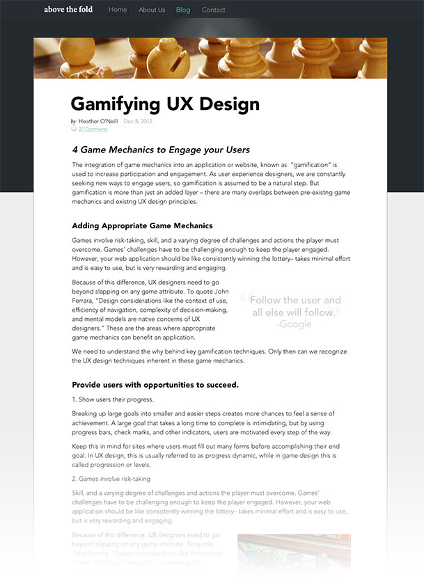
Above the Fold
2013
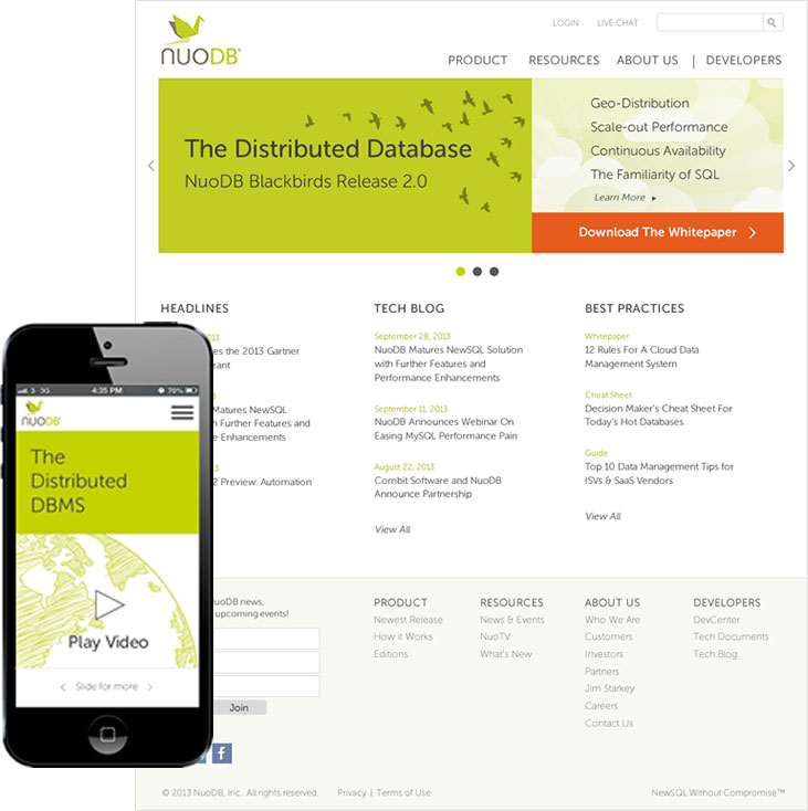
- Creating complete design solutions as Lead Designer and Co-Designer on major site updates - I was solo designer for NuoDB’s redesign
- Creating wireframes and mockups for clients with a wide range of projects
- Updating existing web sites and web applications based on UX requirements
- Working closely with production team to evaluate new and existing UX elements
- Incorporating user feedback and best practices to improve user experiences
- Participating in user research studies
- Presenting ideas, design rationale and user centered options to clients
- Working in a waterfall and agile environment depending on client needs
- Collaborating with a small team to come up with best solutions for Customer Experience
Director of Marketing
Framingham, MA
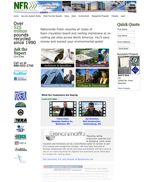
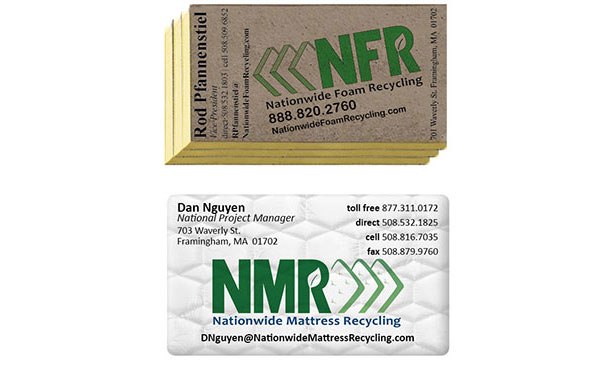
Conigliaro Industries / Nationwide Foam Recycling
2010 to 2012
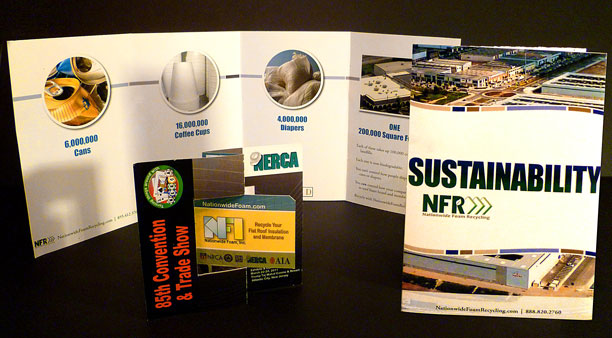
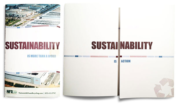
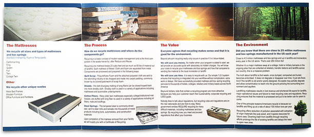
- Designing, producing and creating all marketing materials for Nationwide Foam, Conigliaro Industries and Insulation Depot
- Creating all rebranding for companies including new logos and letterheads, maintaining a unified look throughout all print and graphic materials
- Designing and producing Trade Show materials
- Creating all graphic assets for web sites
- Preparing monthly reports and presentations
- Programing excel sheets with VBA to help with inventory analysis
- Troubleshooting existing spreadsheets and databases
- Supporting IT department with computer issues
- Maintaining all supply orders
- Researching project leads on the internet
Dispatcher / Weigh Master
Framingham, MA
Conigliaro Industries, Inc.
2008 to 2010
- Scheduling all inbound and outbound loads
- Processing all work orders
- Processing all weight tickets for inbound and outbound loads
- Accepting payment and processing local clients
- Coordinating with outside clients
- Answering inbound phone calls
Handyman / Electrician
Lexington, MA
Self Employed
2004 to 2008
- Residential old-work wiring, three and four-way switches, luminaires
- Home sound and TV systems
- Dry-wall installation, taping and finishing
- 60-foot flagstone walkway including grading, fitting and cutting stones
- Field stone wall for retaining garden
Teacher
Lewisburg, OH
Tri-County Public Schools
1990 to 1999
- Music teacher grades K-12 (General Music and Choir)
- Music department chair
- Member of district-wide curriculum committee
- Assistant to technology coordinator, teaching teachers to
use computers and technology in class room