The NuoDB Process
Before coming to us, NuoDB had an independant company do some UX testing of their site. The test showed that the site wasn't capitalizing on NuoDB's strengths in distributed database development, the nav sections, particularly in mobile, needed to be simpler, more subdued, less distracting, and they needed more appropriate CTAs for mobile users. They wanted to be sure that the user could easily figure out what to do. They needed to get user information before they left the site. They decided that a separate mobile version was needed. They also wanted a more "Apple, Inc." feel. This was translated to mean a more open, clean, and flatter design.
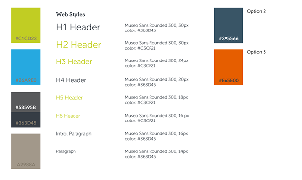
The initial presentation included this sample image that accompanied discussing the process of going from wireframe to mockup, and this style sheet that offered some new color suggestions to add to their corporate pallette. This sample addressed the issues brought up in their UX testing.
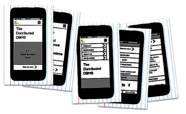
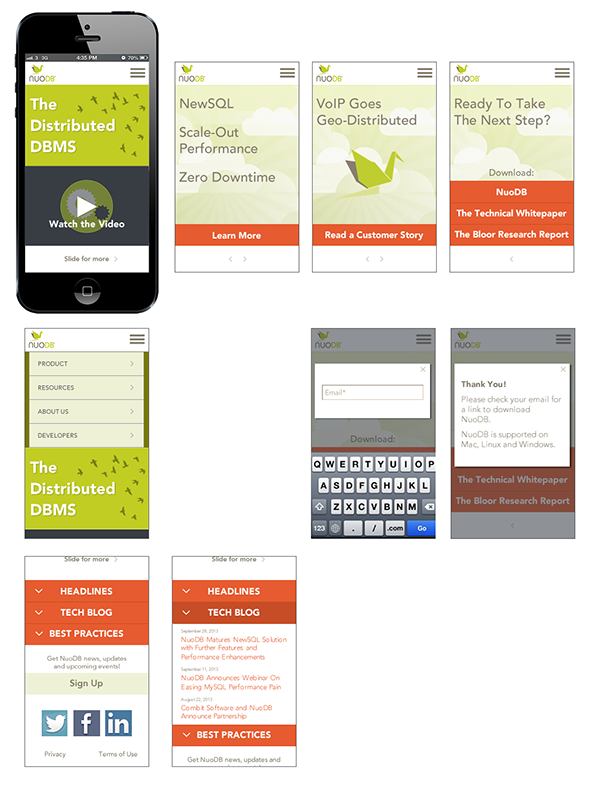
Their initial UX report mentioned that the mobile site was confusing and difficult to navigate. I used some index cards to create a prototype for the mobile version. Mobile interaction was significantly different from the web page. I had test subjects interact with them as if they were using the actual app, and I would switch cards based on what they did. This provided some feedback for what needed to be changed.
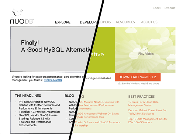
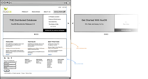
The desktop version shows the a carousel effect used to promote the most important CTAs as well as noting how the page would look on an iPad in landscape and portrait mode. This way I was able to show the client the actual user flows I was suggesting and got their feedback.
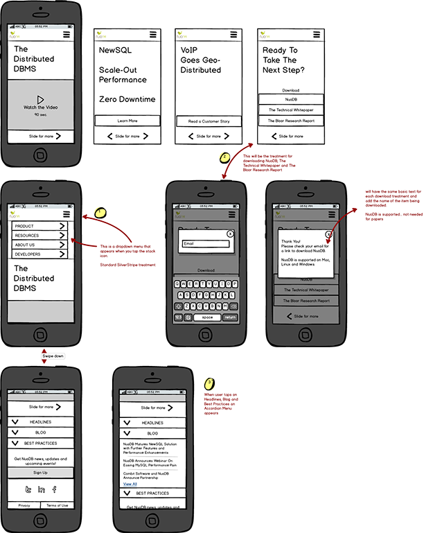
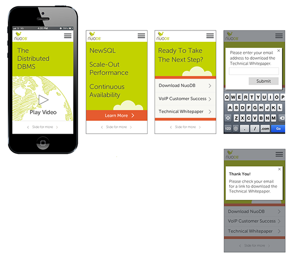
Mockups give the client a more realistic look at what the site will actually look like. I included a version showing a mobile device in landscape mode.
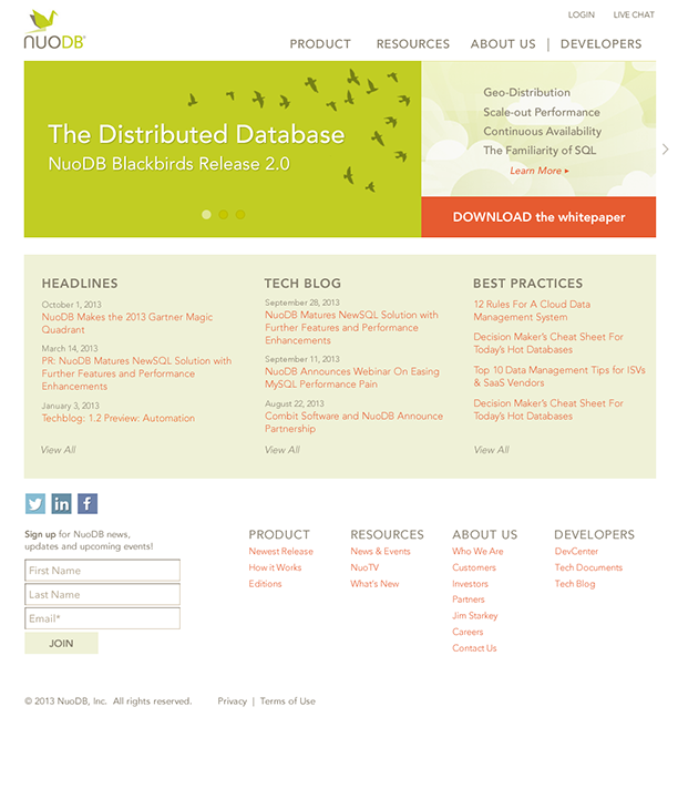
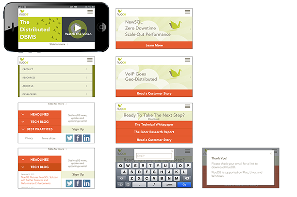
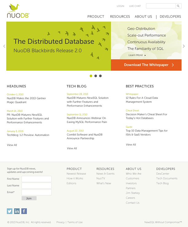
I felt that the splash orange color was getting a bit overused and that took away from it‘s raison d‘être so I limited it to the main CTA. This really helped bring back attention to it. The page also felt a little top heavy so I balanced out the color weight better, lightening the middle and putting a gray background in the footer. Then I minimized everything even more. This did the trick. After several iterations it now feels clean and uncluttered. They loved the design!