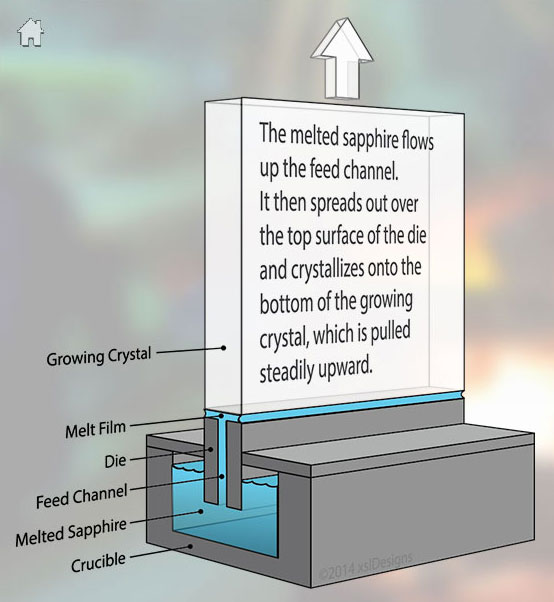
The Sapphire System Process
Sapphire Systems contacted me because they needed a new website. It had to attract investors, look professional and include high quality relevant pictures.
Sapphire is really cool stuff and even though Apple didn't use it for the screen of the new iPhone 6 (yes, I’m a little dissapointed...) people are starting to understand that there is a growing need for sapphire in ultra-modern technology.
I started with research into what sapphire is all about and why Sapphire Systems is so unique. This was something they hadn't really determined for themselves yet. Sapphire is already used in lots of ways. They needed to show potential investors the very specific market needs for these very large crystals that no one else was able to grow.
Images needed to be striking and yet clearly tied in to their niche, and they needed to be seen as the serious scientists and inventors that they are. Personas and user stories were more important in this project than page flows and navigation maps.
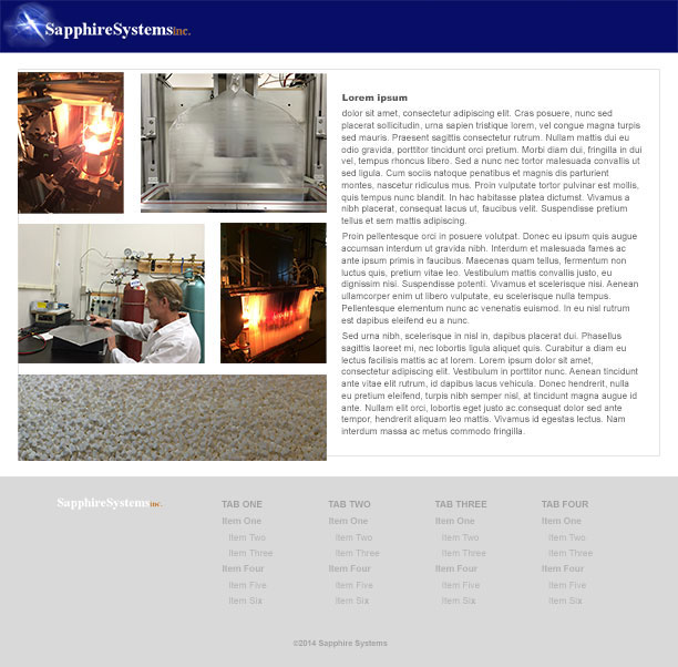
original site design
I saved if for posterity.
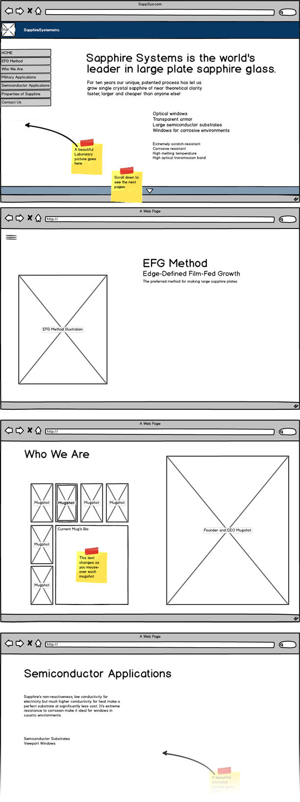
This was v1.0 of their new website, but we are planning for future expansion. Eventually they want to provide a significant amount of extra information regarding their business and the process they've invented.
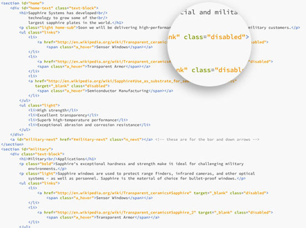
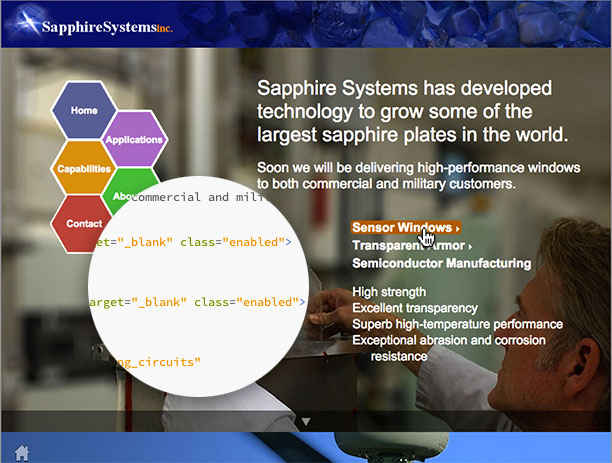
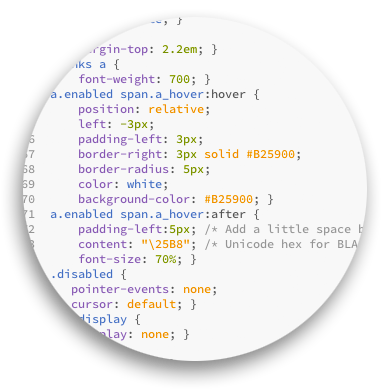
Using an HTML class selector I was able to use CSS to disable most of the links in their site and formatted them as plain lists, but included the hrefs (currently pointing to Wikipedia articles) in the HTML so that when they are ready for the next steps, all I have to do is change the class from “disabled” to “enabled” and they become active links.
I took a screen shot to demonstrate what happens when I enabled the first two links in the list but not the third. Notice the link styling highlights on hover and includes a small right facing arrow.
I love the CSS :after selector and the content property! I even used that little unicode hex character \25B8 right facing arrow to signify links in this site.
This a very rough mockup for extra sub-pages, just fleshing out the idea. We decided early on that this would be saved for another time. It was mostly useful to help the client understand what would be possible in their next round.
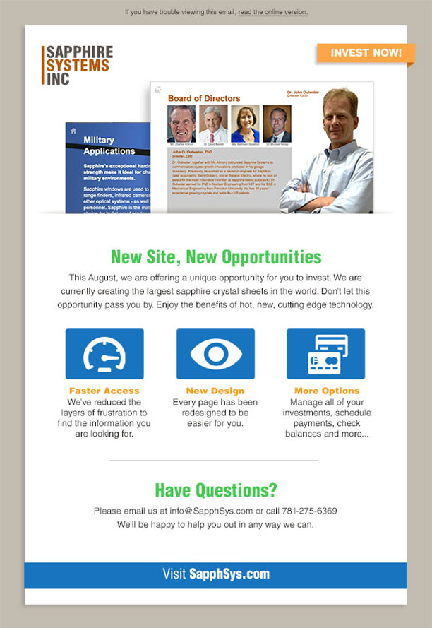
I wanted to show them some other marketing ideas to bring investors to their site so I created this mock-email campaign.
I created this sprite image for the primary navigation on the site. There are more colors available than are currently being used. This provides more flexibility in the future when we add more to the site. The left set are for the normal state, the middle for hover and the right for active state. They liked the idea of flat design, but really wanted the links to act like buttons when clicked. This seemed to be a good compromise.
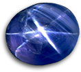
I was pretty happy with the header and the Favicon. The star flare is taken from the actual “Star of Bombay” sapphire.


From the first discussions about the site, the scientists wanted a technical drawing of their process. We couldn't find any good examples for this particular method, so I created this from some napkin sketches the design engineer gave me.
Adobe® Illustrator’s perspective stuff is sweet!